Chapter 13
| Jurisdiction | United States |
"Software makes the world go 'round."
Thomas Peterfly, businessman
A. Linear Software
In this chapter we focus on PowerPoint and Keynote, which are linear software programs. This chapter, like Chapter 12, which concentrated on nonlinear software, explains how to operate linear software in easily understandable terms. Linear software programs are ideal for opening statement and closing argument when counsel is addressing the jury. They are also valuable visual aids for when an expert witness, very much in a lecture manner, explains the expert's field of expertise, findings, and opinions to a judge or jury.
B. The Basics of a Persuasive Computer Slideshow
We have all suffered "death by PowerPoint." In this section, we cover how to design a persuasive computer slideshow with linear software, the most prominent being PowerPoint and Keynote. As we cover the basics of how to create a persuasive and well-designed slideshow, we will simultaneously explain how to avoid the pitfalls that can cause "death by PowerPoint." While these basic principles for constructing a good PowerPoint presentation may seem too basic, sadly, too often they are not followed to the detriment of the subject matter of the presentation, the presenter, and the audience.
1. Informative
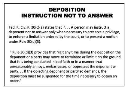
What is wrong with this slide?
Each slide should be informative but not overloaded. The consequence of putting too much information on the slide is that the slide upstages the speaker. Viewers are trying to read while the speaker is trying to keep their attention.
How can we communicate the core information without overloading the slide with information? One way to get the information across without using one slide crammed with information is to break the information into smaller bits and present it on multiple slides. Also, ask yourself whether you have an image that communicates the same concept. For instance, a timeline could be used to communicate the chronology of events rather than a slide with text describing them.
PowerPoint should never be used to simply project the outline of opening or closing onto a screen. An opening or closing where the attorney is constantly looking at the screen to find out what he is going to say next is difficult to follow and often boring. PowerPoint is not meant to be a crutch. The purpose of visual communication is to add something to the presentation that is not captured by words alone. Simply projecting words onto a screen does not constitute visual communication, so it is important for attorneys to look beyond the crutch.
2. Knowing Your Message
The most important starting point for developing any effective visual is knowing the message that you want to convey. Every graphic should have a clear purpose and message. If the message or purpose is not obvious, the graphic should not be shown. You should never display a visual simply for the sake of having a visual. If the visual does not enhance the overall presentation, it should not be used. Consequently, attorneys should identify what the visual adds to the presentation that words alone cannot add. The added value may enhance the educational or persuasive value of the message. A simple exercise is to articulate, in a single sentence, what the visual conveys to the intended audience. This exercise will help clarify not only the goal of the visual but also the overall design of it. When you know what you want to convey, it is much easier to design a visual that conveys that message.
3. Color
There are entire books about color theory that provide insights into how different colors affect the psychological and emotional responses of jurors. The colors that you select to design your slides are important and should be consistent with the message that you are trying to convey with your visual.
The most common background colors are white, black, blue, and gray. White backgrounds create a sense of simplicity and can prevent the visual from appearing too busy. Black backgrounds make the content appear bolder, but the dark background may convey negative emotions about the content. Gray backgrounds are ideal for slides intended to convey confusion or ambiguity. Blue backgrounds are soothing to the eye and create a sense of comfort and ease.
Once the background color is determined, you should consider your accent colors. Red and orange convey warnings, alarms, or moments of poor decisions. Yellow conveys caution. Green conveys positive actions or forward movements.
The impact of color varies, but it is important to use colors sparingly. Excessive use of color can make a visual difficult to understand or follow, or simply unattractive. With any visual, the audience should immediately understand the message when they look at it. If the colors make it difficult to understand or follow, you have undermined the overall effectiveness of the visual.
One proven reliable combination is a dark blue background of either black or blue with light colored text of either yellow or white. These colors work well in both brightly lit and darker rooms. Whatever colors you select, always test the slideshow in the room in which it...
To continue reading
Request your trial